Senior UX/UI Designer · Copenhagen

Design that works
for everyone.

8 years of research, workshops, and tested interfaces — built on the belief that accessible design is simply good design.

8
Years in practice
40+
Projects shipped
WCAG AA
Every project
200+
Users interviewed

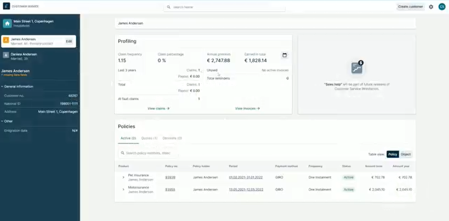
Projects. InsurTech

Case 01

Accessible Patient Forms

NHS Digital · 2023

Redesigned the patient registration and referral forms used by 4M people annually. 18 research sessions with users including those with low literacy, motor impairments, and screen reader dependency — leading to a 34% drop in form abandonment.

AccessibilityResearchTesting
Case 02

Mobile Navigation Redesign

IKEA Digital · 2022

Led a 3-day co-design workshop with cross-functional teams across 6 markets to untangle a navigation structure that had grown over 12 years. Prototyped 4 directions, tested with 60 users, shipped to 180M monthly visitors.

UX DesignWorkshopsPrototyping
Case 03

Podcast Discovery Interface

Spotify · 2021

Investigated why podcast listeners weren't exploring beyond their first show. Diary studies with 24 participants uncovered the real barrier — social proof, not search. Redesigned discovery around listener behaviour, validated with A/B test across 2M users.

ResearchUI DesignA/B Testing
Case 04

Journey Planner Accessibility

Transport for London · 2020

Audited and redesigned the step-free route planner used by wheelchair users and parents with pushchairs. Ran field research at 12 stations, then ran 3 rounds of testing with mobility-impaired users. Achieved WCAG 2.1 AA across the full journey flow.

AccessibilityResearchService Design

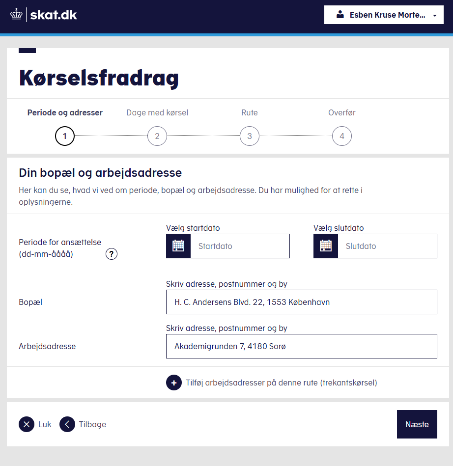
Projects. Tax Administration

Case 01

Tax deduction — redesigning solutions that serve the public

Write-up coming soon.

Case 02

Accessibility — design, testing and compliance

Write-up coming soon.

Student work. IT-specialist in hospitals

Student Project

Student work. Helping healthcare professionals make sense of Sundhedsplatformen

Write-up coming soon.

Building a design system

Personal Project

Turning this portfolio into a design system

Audited this site's own brutalist visual language — flat color blocks, thick borders, hard offset shadows, the Space Grotesk/DM Sans/Space Mono type trio — and formalized it into a documented token scale and a reusable React component library. Every component is verified with an automated render-check and visual QA pipeline before shipping.

Design SystemsDesign TokensReact

I ask "why?" before I open Figma.

My work starts before the screen. User research, stakeholder workshops, and rounds of real-user testing shape everything I make. By the time I'm drawing, I already know what it needs to do — and who it needs to not leave behind.

Accessibility is the constraint that makes the work stronger. Colour contrast, keyboard navigation, screen reader logic, cognitive load — these are design problems, not compliance checkboxes.

See the work →
User Research
Workshops & Co-design
Prototyping
Usability Testing
Accessibility Auditing

Research first. Always.

Research

Interviews, diary studies, analytics. Understanding people before designing for them.

Workshops

Co-design sessions that align teams and surface constraints no brief ever mentions.

Prototyping

From sketch to clickable prototype at the fidelity that answers the specific question.

Testing

Moderated, unmoderated, heuristic. Never launch without evidence.

Accessibility

WCAG audit, assistive tech, real users with disabilities. Built in, not bolted on.

Built for everyone, by design.

WCAG 2.1 AA

Colour isn't the only signal

Every piece of information conveyed through colour also exists in text, pattern, or shape. Contrast is a baseline, not a finish line.

Keyboard

If you can't tab through it, it's broken

Every interactive element has a visible focus state. Skip links, logical tab order — not extras, but the interface itself.

Screen readers

Names that describe, not label

Accessible names, landmark regions, live announcements. Tested with NVDA, JAWS, and VoiceOver before any prototype is done.

Real users

Disability is context, not edge case

People with disabilities are included in every research round — not a separate study, but the same study as everyone else.

WCAG 2.2 AA

Accessibility status: full audit completed, 15 issues fixed

Audited & fixed 4 August 2026 · manual + automated · every component, state, and keyboard path tested

This page was tested against WCAG 2.2: markup, ARIA, color contrast (including focus indicators against their actual backgrounds), keyboard navigation, target sizes, and reduced-motion behaviour. 15 real issues were found — including a focus ring that was completely invisible on two case-study cards — and every one has been fixed. Nothing here is a claim without a receipt.

Full audit & fix report (15 items)
  1. WCAG 1.4.11 · 2.4.7 — Non-text Contrast / Focus VisibleFocus ring was invisible on 2 of 4 case-card colours. The keyboard focus outline used the same blue as the brand palette — on the blue card it matched the background exactly (1.00:1 contrast), and on the green card the two colours turned out to have near-identical luminance (also 1.00:1), despite looking different. Fixed with a white+black double ring that stays visible against every card colour.
  2. WCAG 2.4.11 — Focus Not Obscured (new in 2.2)The fixed nav bar could completely cover a keyboard-focused button. Confirmed live: a "View" button scrolled to by Tab landed entirely underneath the opaque nav. Fixed by giving every focusable element enough scroll margin to clear the nav.
  3. Predictability / 4.1.2The "Live design system" link also silently opened the case-study modal. It shared a CSS class with the modal-trigger buttons, so activating it opened a new tab and a dialog at the same time. Fixed by scoping the modal behaviour to buttons only.
  4. WCAG 1.4.3 · 1.4.11 — Contrast (Minimum)The "200+" stat relied on a non-standard text-stroke to survive. The underlying text colour (yellow on white) was 1.40:1 — nowhere near the 3:1 minimum — and the stroke workaround isn't guaranteed to render everywhere. Replaced with a solid yellow chip and black text (12.41:1).
  5. WCAG 1.4.3 — Contrast (Minimum)Case-card numbers, client names, and descriptions were dimmed with opacity, failing contrast on 3 of 4 card colours (as low as 1.91:1 against the red card). Worst case: "Write-up coming soon." — the only visible content on 3 case studies — failed contrast entirely. Removed the opacity; hierarchy now comes from type scale alone, and every combination passes 4.5:1+.
  6. WCAG 1.4.3 — Contrast (Minimum)Footer copyright and the "Work in progress" door label were too faint (#999 → 2.85:1, #bbb → 1.92:1, both against white). Darkened both to a value already used elsewhere on the page (5.74:1).
  7. WCAG 2.3.3 intentReduced-motion preference didn't cover smooth scrolling. The page correctly zeroed out animations for users with a reduced-motion preference, but anchor-link clicks still smooth-scrolled regardless. Fixed.
  8. WCAG 2.2.2 — Pause, Stop, HideTwo decorative animations (the door glow and the footer pulse) looped forever with no way to stop them. Capped both to a single play-through on load instead of an infinite loop.
  9. WCAG 2.5.8 — Target Size, new in 2.2The logo's clickable area was 22px tall, 2px short of the 24×24px minimum. Added padding to bring it to 38px.
  10. WCAG 2.4.7 — Focus VisibleThe case-study dialog had no visible focus indicator of its own when it took focus on open. Added an explicit, high-contrast focus outline.
  11. WCAG 1.3.1 — Info and RelationshipsThe "Core disciplines" list wasn't marked up as a list for assistive technology, unlike every other grid on the page. Added the matching list/listitem roles.
  12. Reflow / keyboard reachAll primary navigation disappeared below 900px width with no replacement — affecting phones, tablets, and anyone zoomed past ~140%. Built an accessible menu button (keyboard- and screen-reader-operable, closes on Escape or link selection) so navigation is never fully unreachable.
  13. Best practice, 3.2.5-adjacentThe external "Live design system" link gave no warning before opening a new tab. Added an accessible-name hint announcing the new tab.
  14. RobustnessThe skip-to-content link had no explicit focus style of its own, relying on the browser default against its own black background. Gave it an explicit, verified-contrast outline.
  15. WCAG 1.4.12 stress-testedThe hero's spacing below the nav was a hardcoded guess (57px) that drifted out of sync under WCAG's text-spacing stress test (real nav height: up to 73px). Now measured from the actual rendered nav on load and resize.

I'm available for the right project.

If you're building something that matters to people who've been left out of the design conversation — I want to hear from you.

Send me a message
Work in progress